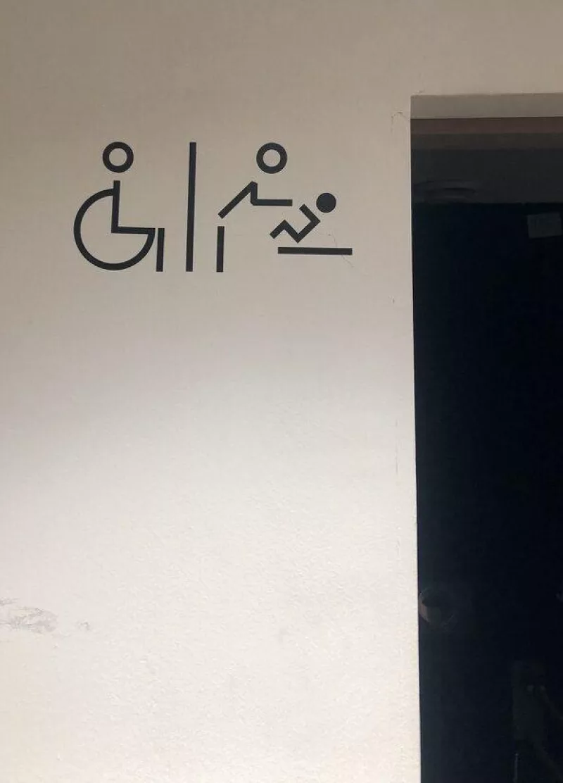
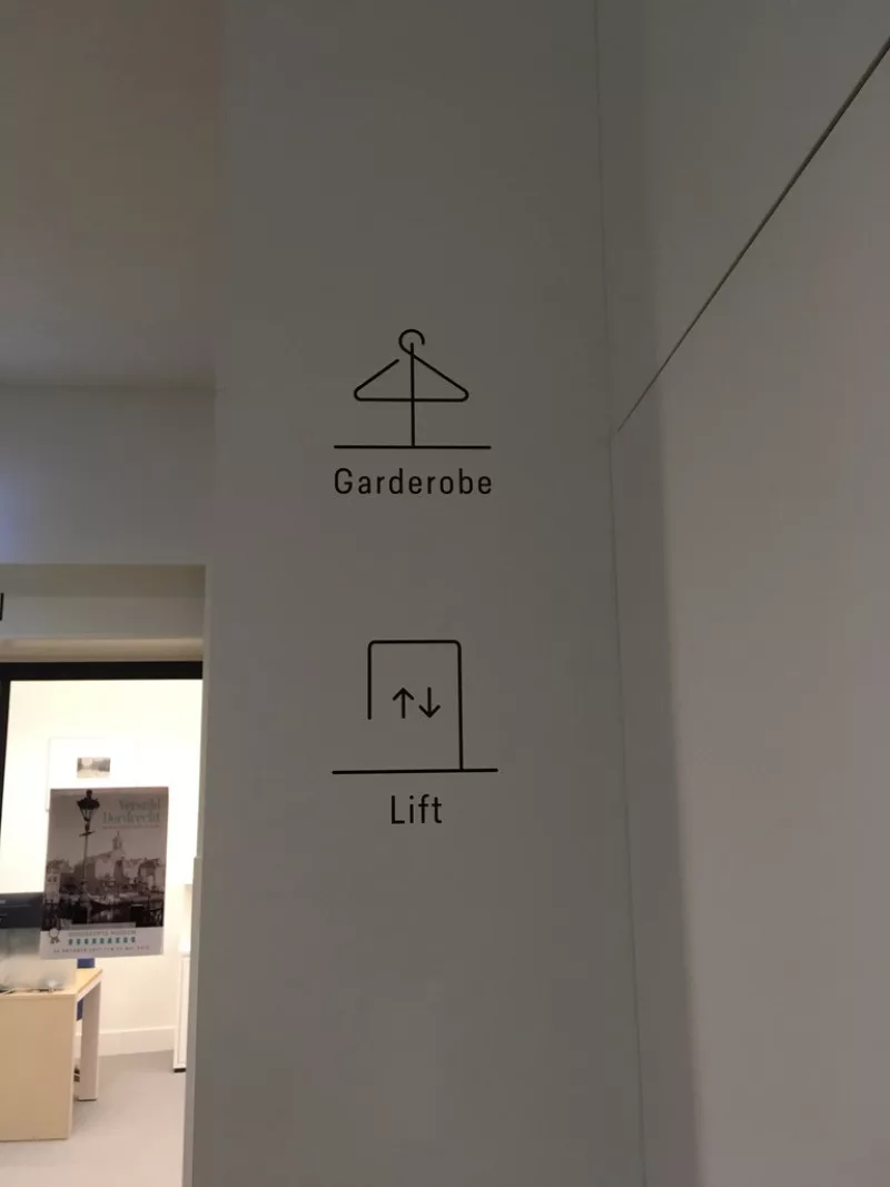
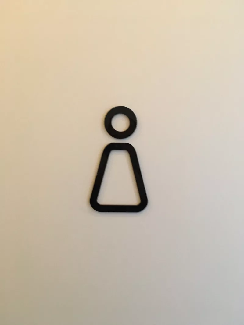
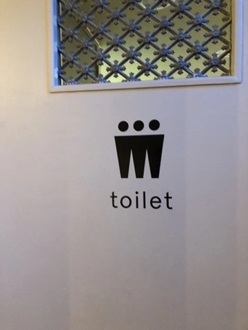
pictogram design
Interesting field (bit niche): how do you design icons and pictograms that are recognisable, communicate clearly to the widest possible audience, and yet have something of their own?
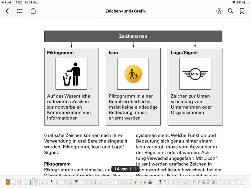
Question for example: why is the baby's head filled in, the parent's not? I think it's a good choice because it gives the baby's figure more "weight", literally and figuratively, it doesn't get so fussy in that area. The visual balance is also better this way. And you have more distinction between child and parent this way.